There’s an interesting feature of SAS BI Dashboard that caught me out when trying to put together some KPI gauges.
We wanted a set of dials that would show us the counts for several types of public security offences. Naturally we configured indicators using count as the measure, but found that the dashboard was showing an indicator per record in our system:
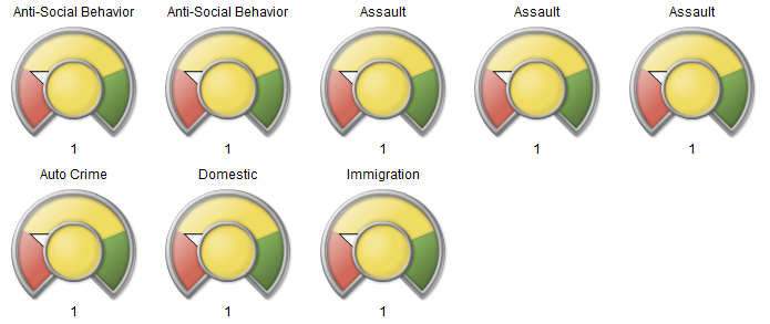
With a bit of faffing around, I eventually found that this was due to the columns I had selected from my data. Specifically, the “uniqueID” column. This led to my big discovery:
The number of dials = The number of unique combinations of column values
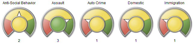
In other words, because I had selected a column where the value was always unique, I got a dial for every row in my table. If I selected just the “category” column, I got the aggregated view I expected:
Perhaps this just shows my SAS Dashboard naivety, but I thought I’d document it anyway.